AS G321: Sophie Packer

Introduction to coursework

Planning and Research.

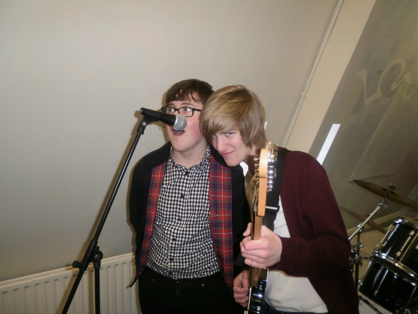
My name is Sophie Packer and I am an AS student. My coursework is split into three section, planning and research, construction and evaluation. For my planning and research i will be researching and creating a school magazine. To complete my coursework i will be using Photoshop and Indesign. For the construction part of my coursework i will be creating a music magazine, front cover, contense page and double spread article. I will then be evaluating my music magazine, commenting on what went well and what did not. Im am worried that because i dont know how to use photoshop or indesign that my work will not be as well presented compared to other members of the class. I am also worried i will not stick to deadlines.
  • Digg
  • Del.icio.us
  • StumbleUpon
  • Reddit
  • Twitter
  • RSS

School Magazine Research


Who is the target audience?

The school children as it is about them and their school. also their parents as they may want to know whats going on in their childs school.

Who/what are they representing? What are they trying to suggest about thier school and the pupils?
That their school is upper class and wealthy as they can afford their own magazine. It also boosts their own popularity showing that the pupils at their school are the best and the "head of the class".

How have they tried to make the colour appealing to the audience?
They have made the colour appealing to the audience by making the colour scheme match the school uniform. This shows the professional side of the magazine, and indicates that the magazine is well thought out and well planned.
Is the front cover of the magazine succsessful? What could be improved?
I think the magazine front cover is succsessful because they have stuck to a colour scheme and its not too busy. They have a clear focus point which you are drawn to. To improve the front cover i would put some more information on it which tells you what is inside the magazine.
  • Digg
  • Del.icio.us
  • StumbleUpon
  • Reddit
  • Twitter
  • RSS

School magazine plans

Who is your target audience? What age range? Gender?
Both girl and boy students, in the years 10 and 11.

What is the purpose of your school magazine?
To inform students of sporting sucsess around the school, and other sporting news.

What style will you adopt for your magazine?
Formal because it is to inform and gives news on sport, it is not a gossip style magazine.

Who will you represent? What will your image be?
The main image will be of a student jumping the high jump, it will represtent 'reaching for the stars' which is a featured article in the magazine.

Potential articles in the magazine include, an interview with Kelly Holmes, Reaching for the stars (pupils achieving in a sporting event) and cricket results.

The name of the magazine is Aspire.
  • Digg
  • Del.icio.us
  • StumbleUpon
  • Reddit
  • Twitter
  • RSS

Possible images for my school magazine


I could have used this image as the front cover for my school magazine however i feel the lighting isnt very good as it is difficult to see toms face.


  • Digg
  • Del.icio.us
  • StumbleUpon
  • Reddit
  • Twitter
  • RSS

School magazine - Front Cover


  • Digg
  • Del.icio.us
  • StumbleUpon
  • Reddit
  • Twitter
  • RSS

School Magazine - Contents page


  • Digg
  • Del.icio.us
  • StumbleUpon
  • Reddit
  • Twitter
  • RSS

Analysis Of Q Magazine

Q started out as a music magazine published monthly in the United Kingdom. Originally it was to be called Cue, the name was changed so that it wouldn't be mistaken for a snooker magazine. Q was first published in 1986, setting itself apart from much of the other music press with monthly production and higher standards of photography and printing, with an emphasis on style.


Q magazine is owned by a major production company called Bauer.

Q magazine is mainly aimed at males from there late teens and early twentys. The price also reflects the audience as it is £3 which is more than both Kerrang and NME, this is becuase the audience for Q have more disposable income.

The audience of Q read this magazine because it informs them of the music and artists they are interested in.
  • Digg
  • Del.icio.us
  • StumbleUpon
  • Reddit
  • Twitter
  • RSS

Background information on Bauer

What is Bauer?
A Magazine publisher.

How did it begin and how has the company grown?

It was founded in Hamburg 1875 by a man called Johann Bauer. It has grown from it beginnings as a faimily business in a printing house into a worldwide publishing empire.

How popular is Bauer?

Bauer produces 282 magazines in 15 countries with 6600 employes worldwide. Bauer has an annual turnover of 1.79 billon euros.

What sort of magazines does Bauer produce?

Womens Magazines. An example of some of their magazines innclide, Womens weekly, womens interest, teen, tv listings and puzzle magazines.

Who is Bauer's target audience?

Middle aged women.

Why do people read these magazines?

To find out their weekly gossip and find out about the things there interested in.

What are articles likely to be about?

Advise on beauty, food, fashion and all things women are interested in.

Does Bauer provide a suscription service? and who is likely to advantage from this service?

Yes and women who read the magazine weekly will benefit as they want a better deal on the price they pay for the magazine.

What types of magazines does it offer for suscription?

Womens interest, tv listings, puzzles.

What is the house style for Bauer magazines?

They all have a main image on the cover, often of women and give yoy headlines previewing the main articles.
  • Digg
  • Del.icio.us
  • StumbleUpon
  • Reddit
  • Twitter
  • RSS

Music Magazine Ideas

Title- Capture. I belive this could be a good name for my magazine as it represents capturing important musical moments.

Audience- 16 to 25 year olds

Genre- Indie

Will it rival other magazines or fill a new gap?

It will rival other magazines but have some of its own unique ideas.

What are its production values?

To connect with the readers.

Price- £2.99

Frequency- Monthly

Photo Shoot ideas
Four band members, guitarist, electric guitarist, drums, and singer.
Name of Band Cylinder Kings.
  • Digg
  • Del.icio.us
  • StumbleUpon
  • Reddit
  • Twitter
  • RSS

Possible Images For My Music Magazine


  • Digg
  • Del.icio.us
  • StumbleUpon
  • Reddit
  • Twitter
  • RSS

Music Magazine- Front Cover

  • Digg
  • Del.icio.us
  • StumbleUpon
  • Reddit
  • Twitter
  • RSS

Music Magazine- Contents Page

  • Digg
  • Del.icio.us
  • StumbleUpon
  • Reddit
  • Twitter
  • RSS

Music Magazine- Double Page Spread

  • Digg
  • Del.icio.us
  • StumbleUpon
  • Reddit
  • Twitter
  • RSS
  • Digg
  • Del.icio.us
  • StumbleUpon
  • Reddit
  • Twitter
  • RSS

Evaluation

For my media coursework I have created a music magazine which features, ‘Cylinder Kings’ a band that have broken up for several years and have now reformed. The genre of my magazine and feature article is aimed at the indie crowd. I first planned for my magazine to be original and fill a gap in the current magazine industry. However I feel that now my product is finished it is far more conventional than first planned but still offers readers what they want. My magazine is conventional as it follows very similar article styles to other well known magazines, for example my feature article is written in a question and answers form, which can be found commonly in many popular magazines such as NME. Typically of this genre there is a bold colour scheme used to create continuity, which I have tried to achieve.

My media magazine represents the indie/rock culture which is primarily men between the ages of 16-25. It represents their lifestyles – the love of live music, fashion and social interaction. I attracted the audience by using lots of images to support these criteria. Images appeal more to the target audience, who prefer the immediate satisfaction of a picture than a block of text. Having said that, my second double page spread does mainly consists of writing but in a very easy question and answers form, which appeals to the male audience. Also the front cover attracts the audience as it gives an insight to what to find in the magazine and is directed at what the audience is interested in, which includes latest music articles about their favourite artist and competition chances.

As my magazine follows the style of magazines such as NME, I believe that companies like IPC media would distribute my magazine. They would be a good company to distribute my magazine because they’re well established in this genre, so would be able to promote my magazine effectively. IPC will get my magazine into chain stores and onto the high street – shops such as WH Smiths and Sainsburys sell a wide range of magazines. The price of my magazine is £2.99 which is competitive against existing magazines of the same type.

Through the process of making my magazine I have had to learn how to use technologies such as Photoshop and Blogger. When I first started my coursework I had never used these before. It took me a while to get to grips of how to use it and learnt very much through the process of trial and error. One of the main problems I faced when using Photoshop was making sure that I had used the same text throughout my magazine. Once I realised I had been using different fonts, it was easy to fix. Another problem I faced was that the Photoshop was quite slow sometimes, which limited the progress I could make. A different technology I used to complete my coursework was blogger. I used blogger to document all my planning and research for my magazine and the magazine itself. The problem with blogger was that it didn’t always do what you were asking it to, for example you would arrange pictures but when you uploaded the post they came up completely different. It’s simplicity was actually a shortcoming – it was sometimes too basic to complete tasks to my standard.

Looking back at my preliminary task I can see how much progress I have made. The preliminary school magazine looks far more unprofessional and I can see that I haven’t made the most of the technology available. Now that I have finished my music magazine I feel that my skill levels have improved dramatically and can really be seen through the quality as compared to the preliminary magazine. I am very happy with most of my magazine, but feel my contents page does let me down. My front cover has turned out much better than first planned as last minute I changed the image which made a difference to the final outcome. This change made my front cover more aesthetically pleasing. At first I had only planned to create one double page spread, however the amount of text was too much to fit to the scale of a double page spread so I had to make another. I am very pleased with both my double page spreads as they stick to the colour scheme and think it looks professional. I think the only mistake I made was the introduction to the band – I wrote in blue and it is slightly more difficult to read compared to the rest of the text. The main improvement that needs to made is my contents page - it doesn’t fit in with the style of the other pages. The colour scheme is lacking the heavy black of the other pages, and as a result looks out of place.

  • Digg
  • Del.icio.us
  • StumbleUpon
  • Reddit
  • Twitter
  • RSS

Marketing Research

I asked the appropriate audience what they thought of my magazine and these were the responses.

1) “I like the colours. They’re bright and eye-catching. The pictures relate to the style of the magazine; the band look trendy, and look like proper indie musicians playing in a garage or something. The only bad thing is that there is a bit too much writing, and some of it is hard to read – the introduction in blue, especially. I feel the price is reasonable and would even be prepared to pay a little more.”

2) “The magazine establishes the character of the band really well. The Q&A article emphasises their persona as a lads band and compliments the images of them – the setting is suitably shabby and they look genuine. The contents page is refreshingly unpretentious and straight-forward compared to real magazines of the same genre. One criticism is that it’s somewhat lacking in colour – the double page spread has a bolder colour scheme, and looks altogether more confident. The large, single image establishes who you are reading about and because they look appealing it draws you into the article and makes the text less intimidating. It also creates a sense of intimacy with the band, and as a result you are more likely to persevere with the article. The second double-page spread is more wordy, but is supported with appropriate pictures and an eye-catching quote.”

3) “I think that the lay out of the double page spread looks very professional and as if I could find it in any well established magazine. The contents page lacks imagination with the layout, using too much text to fill the page. I like how the font remains the same throughout, as it maintains a sense of continuity. My favourite part of the magazine is the first page of the double page spread, as it uses a large photo to attract the readers’ attention, and also a quote giving insight to the contents of the article. Overall the magazine looks well presented and authentic.”

I am pleased with the feedback, which has confirmed the need to work on my contents page. I was happy that the target audience found it “professional” and met their requirements of a music magazine. I wouldn’t change the colour scheme as it was well received by the audience. In future I would include more images and less text in the double page spreads as it was mentioned that it was a little too “wordy”.

  • Digg
  • Del.icio.us
  • StumbleUpon
  • Reddit
  • Twitter
  • RSS